Clover Leaf Emblem
Each leaf of the Clover Leaf emblem carries a symbolic element of Surrey United’s journey:
-
The Railway – representing connection, growth, and the movement that helped shape Surrey.
-
The Barn – a nod to Cloverdale’s agricultural heritage and the firm foundation of our club.
-
The Earth/World symbolizes the diversity and inclusion at the core of our club culture.
-
The Cloverdale Map Outline – anchoring the design in the place where it all began, with respect and gratitude to the Kwantlen, Katzie, and Semiahmoo First Nations, on whose traditional, unceded territories this land rests.
The emblem includes a subtle gold outline, a mark of standards, excellence, and achievement, values that define our approach both on and off the field.

This emblem is a tribute to our home, Cloverdale, BC, a name that quite literally means “valley of clover.” It represents the deep roots, community spirit, and steady growth that have shaped our club since its founding in 1968. Beginning this fall season, every Surrey United youth jersey, from Minis to BCSPL, will proudly feature the Clover Leaf on the left sleeve, a symbol of our identity, legacy, and connection to Cloverdale.
From modest beginnings in 1968 with just six teams, Surrey United has grown into one of British Columbia’s largest and most respected soccer clubs,now home to over 4,400 players across every level of the game. But it’s not our size that defines us—it’s our deep roots, our unwavering commitment to player development, and the vibrant community that fuels everything we do.
The Clover Leaf Emblem is more than just a new design,it’s a symbol of pride, unity, and belonging. It connects every player, coach, and family who wears the Surrey United crest, reminding us of who we are and what we stand for.
A Jersey Inspired by Legacy, Built for the Future
Read the Official Reveal Release here:
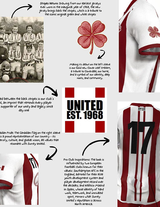
Stripes Return: Drawing from our earliest jerseys ever worn in the inaugural year of 1968, the new jersey brings back the stripes, which is a tribute to the iconic original green and white stripes. Stripes were proudly worn by our club until the 1990s, and we are excited to bring them back in a modern form.
Inspirations from Professional Football (Soccer) Clubs: The look is influenced by two European Football clubs known for their values: Southampton AFC in the England, admired for their elite youth development system and player development record over the decades; and Atlético Madrid in Spain, whose identity of hard work, teamwork, and unrivaled spirit, mirrors what Surrey United’s reputation is across North America.
Canadian Pride: The Canadian flag on the right sleeve is a proud representation of our country - its diversity, culture, and global vision, all values that resonate with Surrey United.
The Clover Leaf Emblem: Making its debut on the left sleeve.
Retro Meets Modern: The open V-neckline nods to iconic jersey designs of the 1980s, while the dual thin stripes down the middle of the back of the jersey are inspired by the reigning World Cup champion, Argentina’s world-renowned, iconic national team jersey.
"UNITED Est. 1968": Tucked between the back stripes is our club’s soul, an imprint that reminds every player and supporter of our unity and legacy since day one.
Finishing Touch: The white band at the base of the jersey perfectly balances our red home kit, offering a bold and clean look to match the elite level of play in the BCSPL. This design is inspired by the AC Milan jersey, circa 2015.
BCSPL Home Jersey


